UI
Plotting Metrics
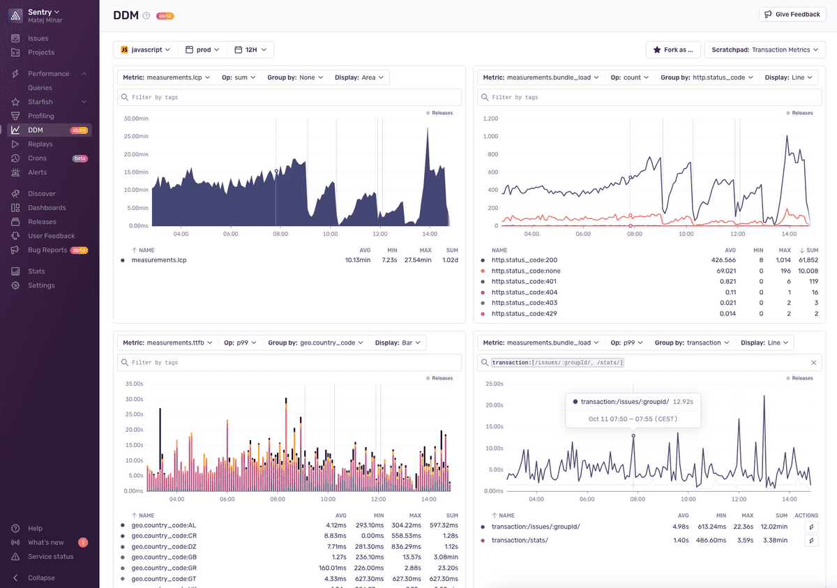
In order to plot your metrics, we have developed a prototype user interface, which you can look at as a scratchpad. A scratchpad in our vision is essentially a temporary dashboard that is stored only locally in your browser and has the capability to be shared since the information about the dashboard is encoded into the URL.
Enabling the UI
The first step towards using the UI is to enable it, since right now it’s feature flagged. These two flags need to be turned on:
organizations:custom-metrics- ingestion and UIorganizations:ddm-ui- UIorganizations:metric-meta- sample events and code locationsorganizations:use-metrics-layer-in-alerts- custom metric alerts
See our guide on feature flags to learn how to do that.
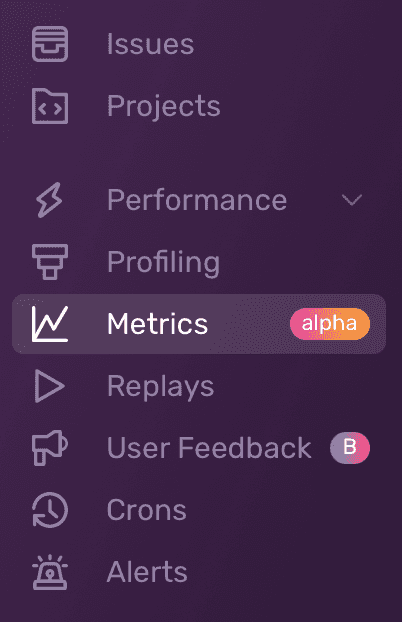
Once you have the feature flag enabled you will magically see a new sidebar item called Metrics and now the fun begins!

Using the UI
The UI is quite straightforward. You will see an option to add a widget, and each widget will have a series of properties. These properties include the metric you want to plot (identified by name), the aggregate operation to perform, the grouping method, and the display type.

You will also be able to save your scratchpad. This means that Sentry will store the representation of the scratchpad in your local storage. This allows you to maintain multiple scratchpads during an exploration.
Dashboards and Alerts
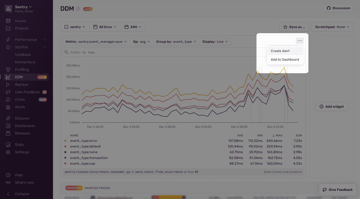
You can alert on custom metrics. As always, you can create these alerts either from the Metrics page or by using the Alerts Wizard.
Metrics also play nicely with Dashboards. You can plot custom metrics in the Metrics tab and then later save them to a dashboard or go through the Dashboards directly.
